


Company:
Capitalise
Year:
2023
Overview
This project was about making life easier for designers and keeping the brand consistent. Instead of everyone spending time recreating buttons, icons, or layouts from scratch, we built a central library of reusable elements and clear guidelines.
The Why
Making consistent and creative marketing designs without a UI kit is like trying to master cooking overnight for a crucial dinner date: stressful, messy, and not always successful. At Capitalise, we realized we needed a better way. That’s how our journey toward building a Marketing Design System began: with a clear need for consistency, speed, and efficiency.
Just like HelloFresh delivers pre-packaged ingredients with easy instructions, our Marketing UI Kit provided designers with ready-to-use elements and clear guidelines. The goal was simple: make everyday design tasks faster and less technical, so we could spend more time on creativity, without compromising quality.
How it started
When our junior marketing designer, Andreina joined Capitalise, she realized how scattered things were. Design assets lived across different apps, there were no brand guidelines, and the brand identity itself hadn’t really been defined yet.
Trying to navigate that chaos while delivering work on tight deadlines was overwhelming. Instead of focusing on creativity, most of her time went into wrestling with technical details. It wasn’t a great setup.
Claire, our senior marketing designer, created and contributed to the first version of the brand guidelines catalog. It was a simple PDF stored on Google Drive, accessible to everyone, and it gave us a starting point for consistency. But not long after, Claire went on maternity leave, and suddenly Andreina was left on her own, with all the marketing design tasks landing on her desk.
Defining the scope
After Claire left, we faced a big challenge: how to keep our brand consistent across projects without her guidance. As the senior designer, I knew it was important not just to protect our brand identity, but also to support Andreina, who was suddenly left to handle everything on her own.
I decided to step in and guide her through the process. Together, we looked at how our designs were being created: across Figma, Canva, and Adobe Suite, and quickly realized that this scattered approach was holding us back. To make things a little easier right away, we added elements from the brand guidelines into each of these software libraries.
That small step gave Andreina the support she needed and kept us moving forward, but it also showed us the bigger picture: what we really needed was a centralized system to make design work consistent, efficient, and creative.
During our discussions, I suggested we create a Figma Marketing UI Kit. Instead of juggling assets across different tools, this would give us a single place to keep all our design elements and guidelines.
Think of it as a toolbox for the whole design team: everything you need in one spot, easy to find, always up to date, and built to match our brand standards. It meant Andreina could spend less time searching or recreating elements, and more time focusing on the creative part of the work.
Defining the scope
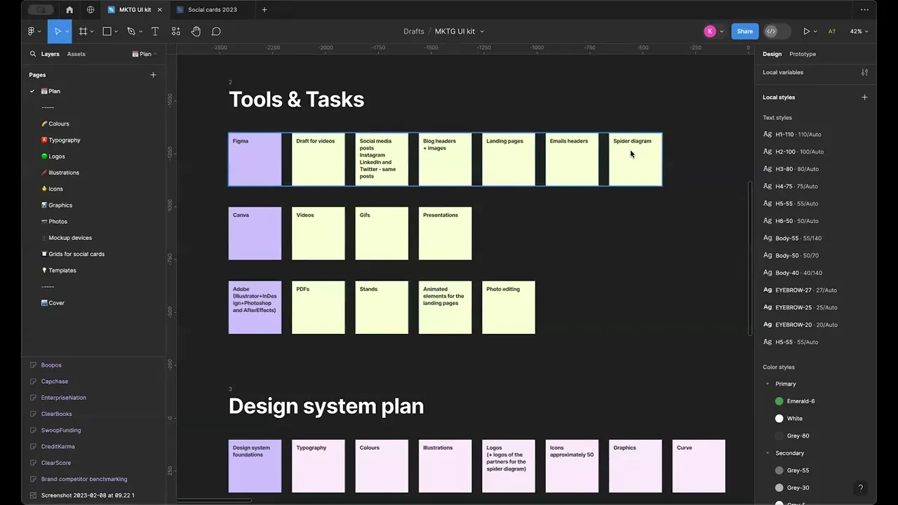
To make sure the project would succeed, we started with a structured approach. First, we looked closely at how the marketing team actually worked day to day, using tools like Figma, Canva, and Adobe Suite. By mapping out their processes, we were able to see where things got messy and what slowed people down.
From there, we identified the essential materials that needed to go into the Marketing UI Kit: everything from logos and color palettes to buttons, icons, and layouts. This gave us a clear roadmap for what to build and how to organize it so it would truly support the team.
To make such a big project feel manageable, we set up a routine. Every week, we reserved two-hour sessions just for working on the Marketing UI Kit together. These dedicated blocks of time helped us make steady progress, stay focused, and keep each other motivated, instead of feeling overwhelmed by the scale of the work.
Foundational elements
We started by laying the foundation for the Marketing UI Kit. Focusing on the essentials: colors, fonts, logos, and illustrations, we organized everything according to the principles of Atomic Design. This gave us a solid base and made it easier to keep every design element consistent and coherent across all projects.
Templates
By using the Atomic Design approach and dedicating time to careful planning, we made sure every part of the UI Kit was thoughtfully designed and fully aligned with our brand guidelines. Step by step, we built templates for a variety of marketing materials: social media posts, blog headers, landing pages, email headers, covering all the different needs of our marketing team.

Integration into the Workflow
To make sure the marketing team could fully benefit from the UI Kit, we held hands-on workshops in Figma. We showed them how to use the templates effectively and walked them through each component. Alongside the templates, we provided clear instructions so everyone knew exactly how to apply the brand guidelines.
These workshops gave the team practical experience and confidence.
The Marketing UI Kit and templates weren’t static: they needed to evolve as the organization’s needs changed. Because of this, we stayed committed to continually refining and updating the kit, making sure it remained a living resource that could adapt to new projects, tools, and workflows.

Conclusion
In the end, building the Marketing UI Kit was all about making design simpler and keeping our brand consistent.
With thoughtful planning and hands-on work, we established stronger design standards and made the team more efficient. Even after significant team changes: when two product designers who had occasionally helped with marketing tasks were laid off, Andreina had the support she needed. The UI Kit also saved time and reduced costs, proving its value for both the design team and the business.


